LA Chargers Logo Fiasco
Confirmed 41,703
Part of a series on NFL / American Football. [View Related Entries]
LA Chargers Logo Fiasco
Part of a series on NFL / American Football. [View Related Entries]
About
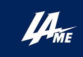
The L.A. Chargers Logo Fiasco is the online backlash against the California-based NFL football team's new logo that was introduced following its relocation to Los Angeles in January 2017. Upon its debut on Twitter in January 2017, it became widely ridiculed by fans, celebrities, media outlets, and even the official accounts of other sports franchises, mainly due to its resemblance to the Los Angeles Dodgers' iconic white-on-blue logo, ultimately prompting the franchise to drop the logo.
History
The Los Angeles Chargers were created as a franchise in the now-defunct American Football League in 1960. After only one year in Los Angeles, the Chargers moved to San Diego where they would remain for more than 40 years, until in late 2016, when the Chargers, along with St. Louis Rams, announced their return to home city of Los Angeles after heightened efforts by the NFL to revitalize LA as home for professional sports teams. On January 12th, 2017, the Chargers unveiled a newly designed logo via its Twitter account on the day of its official debut as the Los Angeles Chargers.

Fans on the internet immediately took note of the similarities between it and the logos of the Major League Baseball (MLB) team Los Angeles Dodgers and Florida-based National Hockey League (NHL) team Tampa Bay Lightning, with many deriding it as a cheap knock-off or a combination of both the Dodgers and Lightning. Soon enough, both the Lightning and Dodgers chimed in on the joke on Twitter
@TBLightning you said you'd call.
— Los Angeles Dodgers (@Dodgers) January 12, 2017
Other sports franchises also began to joke about changing their logos in similar ways, such as the Dallas Stars hockey team posting a fake logo that was a recolor of the logo used by the Dallas Cowboys football team.
new logo. hope this is cool,
dallascowboys</a> <a href="https://t.co/cCBPHjqWxP">pic.twitter.com/cCBPHjqWxP</a></p>— Dallas Stars (DallasStars) January 12, 2017
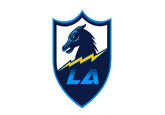
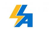
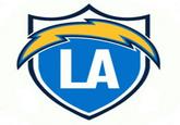
The next day, the Chargers updated their Twitter profile picture with a new version of the logo (below left), changing the color scheme to the powder blue and yellow combination that the franchise was most known for. While it was a bit more accepted, they were still mocked for so quickly backpedaling on the first logo design. Despite the backlash, the Chargers then changed their logo yet again (below right), this time abandoning their previous design entirely.


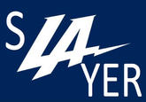
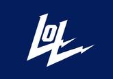
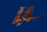
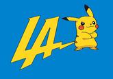
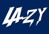
In addition to ridicule from the media and other sports teams, fans on the internet began to post their own edited versions of the Chargers logo to mock them as well.


Spread
The mocking of the Chargers' poor effort in making a logo originated on Twitter, but as more talked about it, the fiasco was mentioned by several local and even national media outlets. The fan-made memes and edits spread from Twitter and also cropped up on the /sp/ board of 4Chan, the r/NFL subreddit, and multiple NFL-related Facebook accounts.
Search Interest
External References
[1] Twitter – Los Angeles Chargers
[2] Sports illustrated – The best internet reactions to Chargers' new logo
[3] San Diego Union Tribune – Other sports teams roasted the Chargers for their new logo, L.A. move
[4] Cnet – New LA Chargers logo shredded on social media
[5] Daily Smark – LA Chargers Release New Logo, Immediately Gets Destroyed On Twitter
[6] Daily Smark – LA Chargers Update Logo Following Embarrassing Initial Reveal
[7] Daily Smark – After Fans Rip Chargers Second Attempt At Logo, Team Changes Logo For Third Time In Two Days On Twitter
Recent Videos
There are no videos currently available.
Recent Images 14 total
Share Pin
Related Entries 96 total
Recent Images 14 total
Recent Videos 0 total
There are no recent videos.





Comments ( 30 )
Sorry, but you must activate your account to post a comment.
Please check your email for your activation code.